


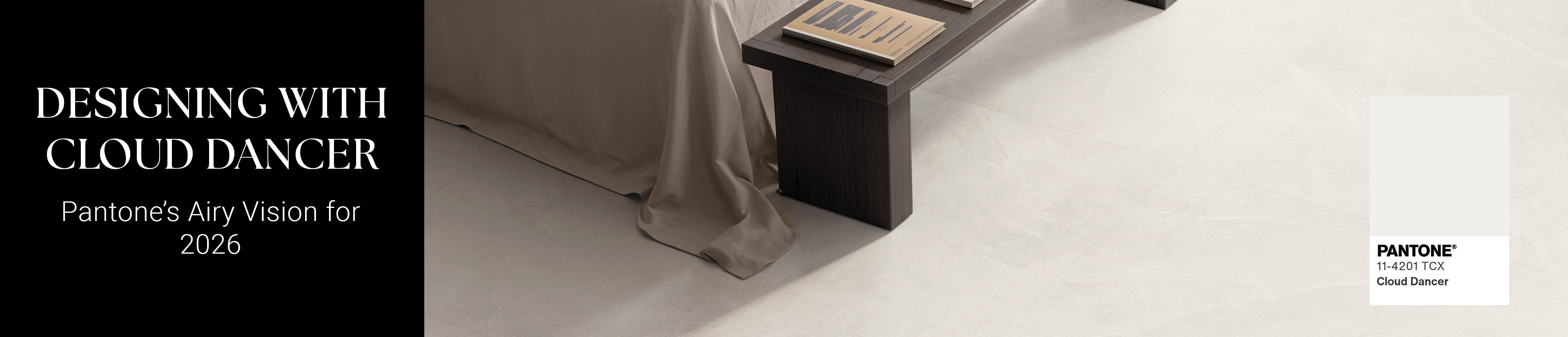
Designing with Cloud Dancer: Pantone’s Airy Vision for 2026
By: Nemo Tile + Stone
Why “Cloud Dancer” — and what it means for 2026
This year, Pantone opted for something unexpected: a soft, airy white. According to Pantone, “Cloud Dancer” is a “billowy, balanced white imbued with a feeling of serenity.” (Architectural Digest).
As the institute explains: “Similar to a blank canvas, Cloud Dancer signifies our desire for a fresh start. Peeling away layers of outmoded thinking, we open the door to new approaches. An airy white hue, PANTONE 11-4201 Cloud Dancer opens up space for creativity, allowing our imagination to drift so that new insights and bold ideas can emerge and take shape.” - Laurie Pressman, Vice President, Pantone Color Institute (Designboom)
Importantly: this is the first time Pantone has chosen a white tone as Color of the Year in the history of the program. (Campaign Live) In an era marked by overstimulation, noise, and complexity, “Cloud Dancer” feels like a cultural deep breath -a chance for clarity, calm, and creative renewal. (Forbes)
What “Cloud Dancer” evokes: the aesthetic & emotional tone
- A blank canvas for creativity — The softness and neutrality of Cloud Dancer invite layering, accents, and personal expression. It doesn’t shout; it offers space for other colors or textures to shine.
- Mindful minimalism & clarity — As many design outlets note, the color reflects a societal craving for simplicity and quiet, especially after years of digital overload. (House Beautiful)
- Versatility in style and mood — Because Cloud Dancer lies between warm and cool whites, it adapts to different interiors, lighting situations, and design vocabularies: from airy Scandinavian minimalism to refined “quiet luxury.” (Architectural Digest)
- Timelessness and subtle sophistication — White has always had a place in design; but by elevating it, Pantone signals that “timeless calm” is a strong contender for 2026’s dominant aesthetic. (The Architect's Newspaper)
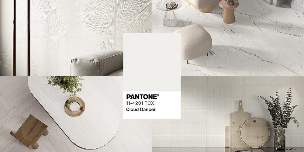
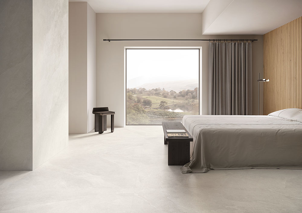
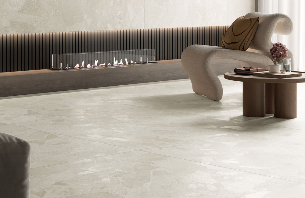
Bringing “Cloud Dancer” into your home: curated tile picks
Here are some tiles that lean into the spirit of calm, simplicity, and clean space. These are ideal if you’re thinking about a fresh start in your living space.
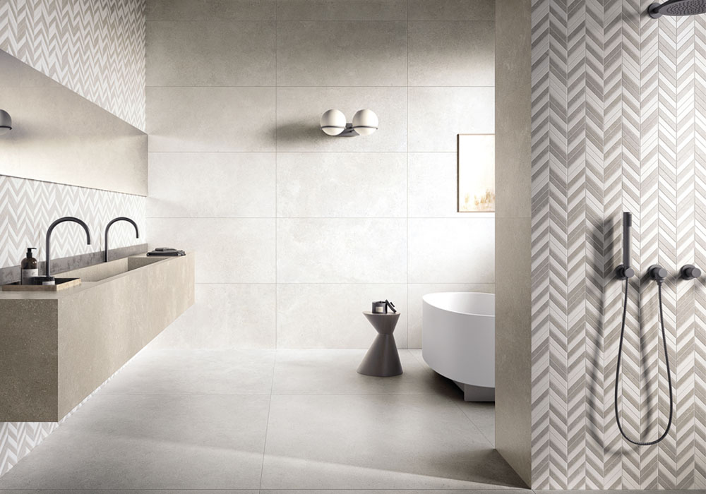
Ardoise - White
A refined, soft white surface that echoes the calm minimalism of Cloud Dancer. Ardoise brings a subtle texture and a natural stone feel, making it a perfect foundation for serene, airy interiors.
Apollo - Starlight
Apollo Starlight captures light with elegance, offering a whisper of movement reminiscent of drifting clouds. Its luminous quality pairs beautifully with Cloud Dancer’s concept of clarity and open creative space.
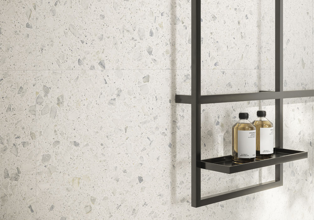
Bryce - Perle
With a gentle, pearlescent tone, Bryce Perle introduces warmth and organic softness while maintaining a crisp, clean aesthetic. It’s an ideal complement to interiors built around lightness and mindful simplicity.
Soho - White
Timeless, versatile, and effortlessly modern, Soho White embodies the purity and quiet sophistication that Cloud Dancer represents. A go-to choice for creating minimalist yet inviting spaces.
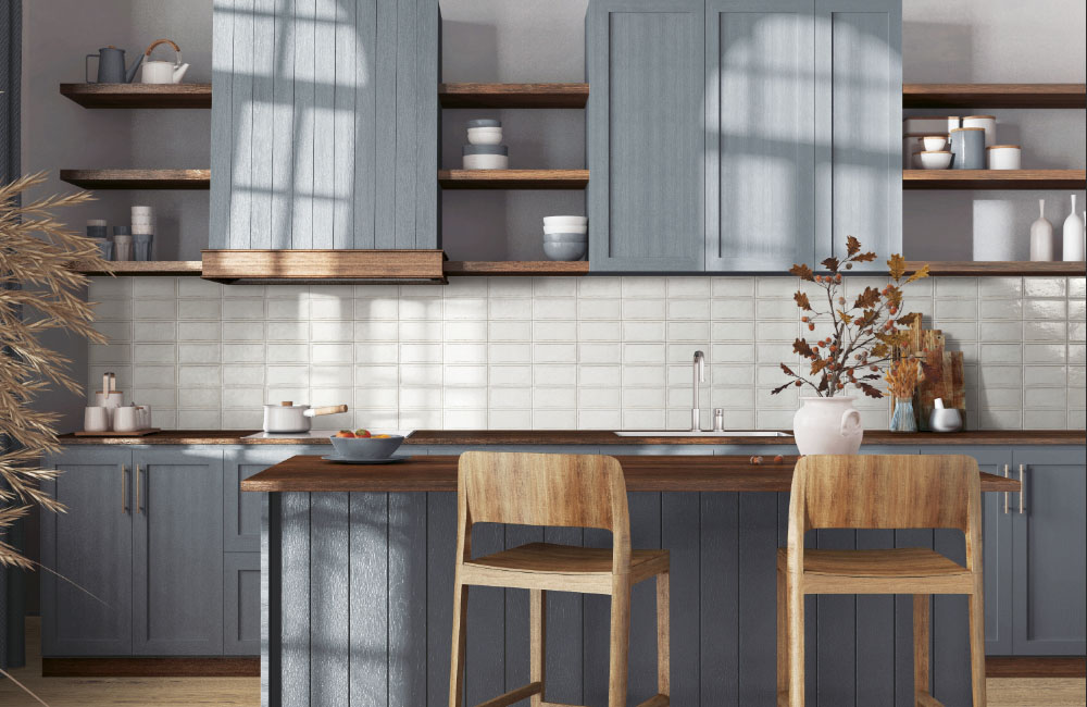
Rialto - White
Rialto White offers soft tonal variation and artisanal character, making it a beautiful way to layer dimension into an all-white palette. It reflects the handmade charm that pairs well with Cloud Dancer’s understated elegance.
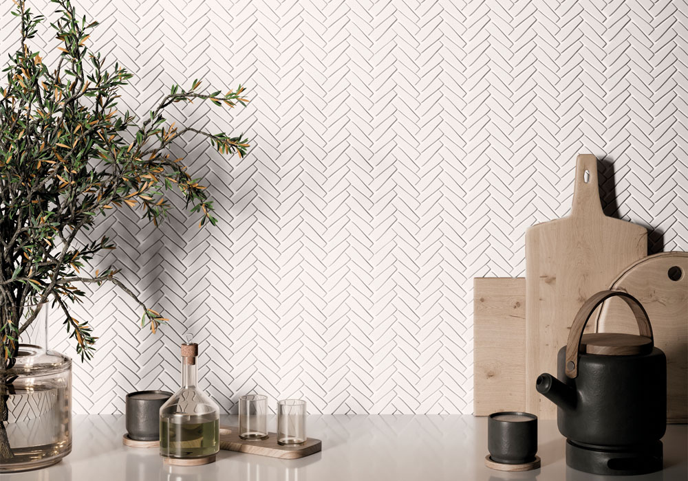
Nash - White
Crisp and contemporary, Nash White delivers a clean canvas for bold design choices or serene simplicity. Its subtle texture and modern profile align perfectly with the spirit of renewal expressed through Cloud Dancer.
Start with a neutral foundation; crisp whites like Nash or soft, natural tones like Bryce to create a calming, open base. Layer in gentle textures, muted contrasts, and intentional negative space to let the color’s airy softness shine. Finish with purposeful accents and natural light to bring warmth, personality, and quiet elegance to the room.
Looking Ahead: What this color says about 2026
“Cloud Dancer” speaks to a collective desire for quiet reflection, simplicity, and renewal. It signals that after years of overstimulation and color saturation, many people may be craving environments that allow clarity - both visually and mentally. It’s a reminder that sometimes, the most powerful statements are quiet.
If you build your space around this ethos - using subtle tones, plenty of white space, and gentle textures - you might find more than a stylish home; you might discover a calmer mindset.